


Late last week I was asked about the relative underperformance of utility stocks over the past few weeks. Admittedly, that question came a bit by surprise. I don’t always follow utilities as closely as sectors like tech or energy that either dominate major indices or investors’ focus. I knew that the normally sleepy utility sector had been more volatile than normal, but was somewhat shocked to see that the PHLX Utility Sector Index (UTY) had a roughly 20% round trip in recent weeks. In trying to analyze whether this sort of move had precedents, I was also surprised to see a potentially distressing pattern in the graphs.
Utilities are meant to be defensive. While the demand for their output is impacted by economic activity, they have a very high and stable baseline. While industrial demand might fluctuate somewhat, the demand from consumers remains quite stable. They operate in a highly regulated environment, which limits their profit potential but essentially guarantees a baseline profit. That allows them to pay relatively generous and stable dividends. These factors often allow the utility sector to outperform during rocky times for equities. The sector’s appeal suffers when their dividend payouts become relatively unappealing relative to bond rates or when their input costs rise faster than their ability to pass them along to customers. Both have occurred this year, however, which has led to the recent volatility.
The chart below demonstrates the relatively eye-popping moves in UTY during this year. This supposedly sleepy index had not one, but two round-trips of roughly 20%.
UTY (blue/white daily bars) vs SPX (green line), Year-To-Date
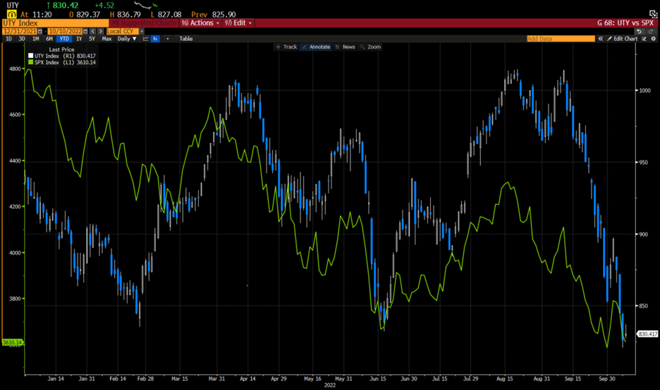
Source: Bloomberg
Then I looked back over the history of UTY to see if there were either similar periods of volatility, or periods when UTY outperformed SPX for extended periods of time only to plunge faster. The graph below shows a few precedents – highlighted by arrows – when these occurred. None are particularly encouraging.
UTY (blue/white quarterly bars) vs SPX (green line), Since 1987
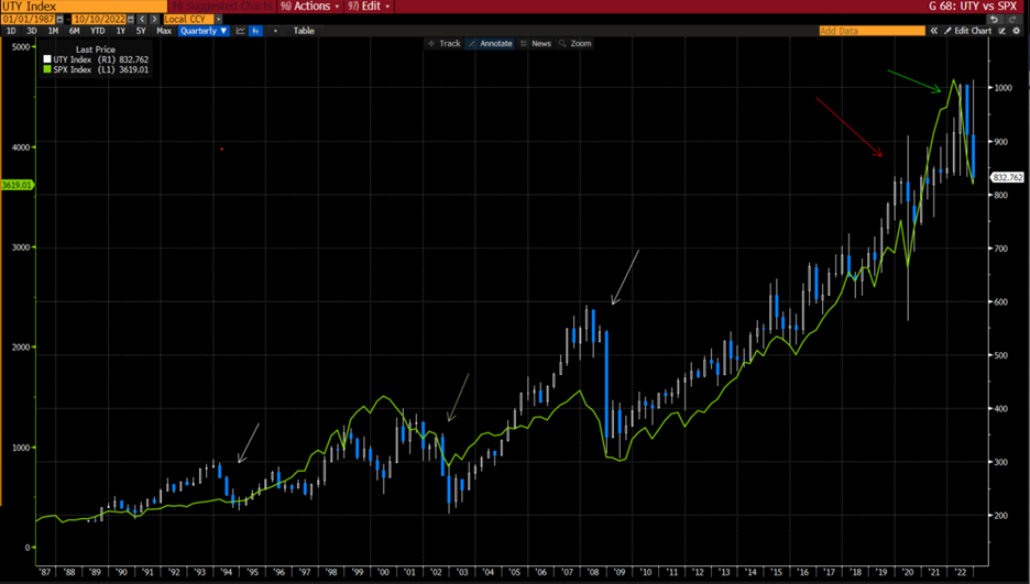
Source: Bloomberg
For better or worse, we see similar patterns during some of the more vicious market selloffs during the past 30+ years. It is evident at a few points in over just the past five year, as shown below:
UTY (blue/white daily bars) vs SPX (green line), 5 Years
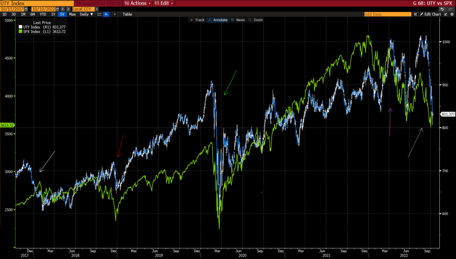
Source: Bloomberg
We see the pattern repeat in the weeks leading up the “volmageddon” of early 2018, during the quick bear market of late 2018, during the chaos of 2020’s Covid selloff, and earlier this year.
I interpret the data this way: it is rarely a good thing when investors move into defensive utilities and then throwing in the towel later. Little is more frustrating to investors than moving into defensive stocks only to find them abruptly underperforming. Yet this is not necessarily bad news for markets as a whole. It could be considered a sign of the long-awaited capitulation that would signal a market bottom. Remember, capitulation occurs when investors become thoroughly disenchanted with equities. Investors move into defensive stocks when they want or need to stay relatively fully invested in equities, then sell those defensive stocks when they decide that they want less overall exposure.
When we look at some of the periods highlighted in the second graph, we see that they tended to precede the abysses of the bear markets by just a few months. If taken in isolation that could make the current situation a possible harbinger of better times to come. But there are two problems with that partly sunny view. First, the bottoms in the major bear markets earlier this century came only after further painful declines in the broader market. Second, we have not faced our current levels of inflation during the entire life of UTY. If more rate hikes are to come, we likely need a clearer rate picture before the full capitulation occurs.
Disclosure: Interactive Brokers
The analysis in this material is provided for information only and is not and should not be construed as an offer to sell or the solicitation of an offer to buy any security. To the extent that this material discusses general market activity, industry or sector trends or other broad-based economic or political conditions, it should not be construed as research or investment advice. To the extent that it includes references to specific securities, commodities, currencies, or other instruments, those references do not constitute a recommendation by IBKR to buy, sell or hold such investments. This material does not and is not intended to take into account the particular financial conditions, investment objectives or requirements of individual customers. Before acting on this material, you should consider whether it is suitable for your particular circumstances and, as necessary, seek professional advice.
The views and opinions expressed herein are those of the author and do not necessarily reflect the views of Interactive Brokers, its affiliates, or its employees.


