


For those of us who have been riveted by the inverted yield curve, it is fascinating to see the 2-10 inversion fade away over recent days.
To refresh, the 2-10 inversion refers to the difference between 2-year and 10-year US Treasury yields. It is typical for longer-term yields to be higher than those of their shorter-term counterparts. All things being equal, shorter-term bond prices are usually less volatile and more liquid. Those factor into why yield curves tend to be upward sloping, when viewed from left to right. The following graph compares the current US Treasury yield curve versus how it looked five years ago:
US Treasury Yield Curves, Today (green), 5-Years Ago (yellow)
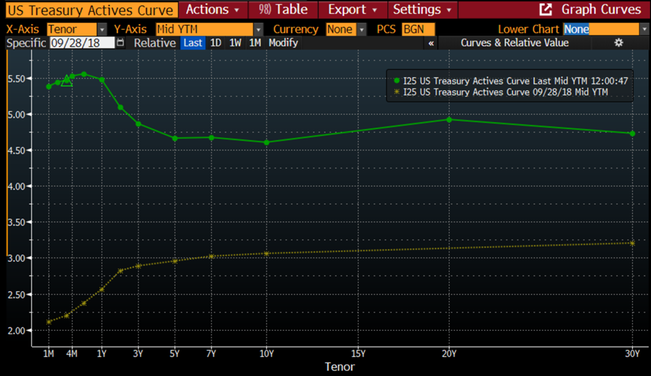
Source: Bloomberg
The difference, besides the fact that the current curve is notably higher than its predecessor, is that today’s curve slopes lower before flattening out rather than rising. This is the inversion to which we refer.
As monetary policy changed from aggressively accommodative to restrictive, we saw the relationship between 2- and 10-year yields change dramatically. That will be evident in the chart below, which shows the 2-10 spread for the past 30 years. Since it is commonly believed that 2-10 inversions signal recessions, we have added the beginning and end of recessions, as declared by the National Bureau of Economic Research (NBER), the group that (for better or worse) officially designate (in hindsight) when recessions begin and end:
30 Years, 2-10 Treasury Yield Spread (blue/white bars) vs. NBER-defined Start (red) and End (green) of US Recessions
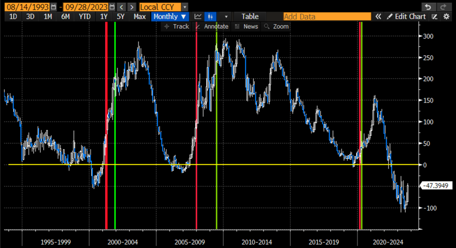
Source: Bloomberg
You should note that except for a very brief inversion in mid-1998, the recessions were all preceded by inverted yield curves. You should also note that the recessions only began after the yield curve normalized. That is why we should pay special attention to the fact that the inversion has been rapidly shrinking. The negative economic ramifications might be quite negative.
In a piece from early August, when bond yields began to spike higher, we noted that stocks and bonds can send different messages for an extended period. On that day both yields and stocks rose sharply, and I reflected that when I started in the business in 1987, bonds were mired in a bear market for most of the year while stocks rallied sharply. Until, of course, that reversed quickly. The following graph demonstrates the movements that year:
January Through October 1987, 10-Year Treasury Yields (white), SPX (blue)
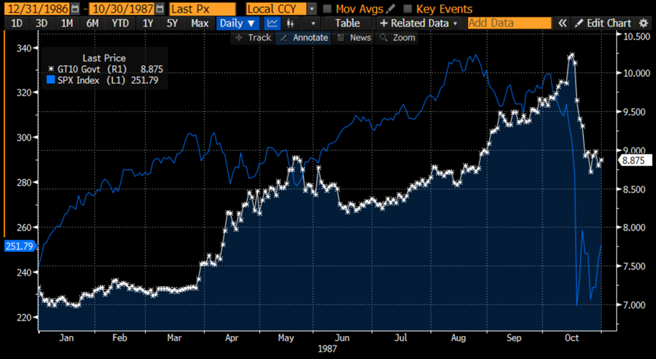
Source: Bloomberg
For better or worse, the current year-to-date chart doesn’t look all that different from 1987’s year, so far. (Of course, the actual values are vastly different – yields much lower and stocks much higher)
2023 Year-to-Date, 10-Year Treasury Yields (white), SPX (blue)
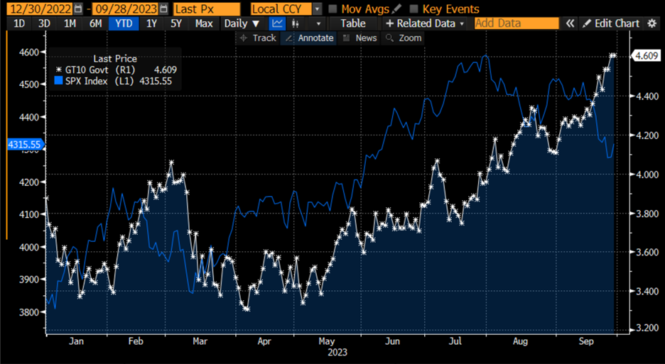
Source: Bloomberg
I’ve never been a huge fan of simply drawing one graph over another. It can lead to simplistic and specious conclusions. But in this case, we can see that there is indeed a historical precedent for the current trend in bonds versus stocks. It would be irresponsible to suggest that the outcome for this year’s stock market will be analogous to 1987, but it does behoove us to wonder whether the current valuations are sustainable given the dislocations in the bond market.
Join The Conversation
If you have a general question, it may already be covered in our FAQs. If you have an account-specific question or concern, please reach out to Client Services.
Leave a Reply
Disclosure: Interactive Brokers
The analysis in this material is provided for information only and is not and should not be construed as an offer to sell or the solicitation of an offer to buy any security. To the extent that this material discusses general market activity, industry or sector trends or other broad-based economic or political conditions, it should not be construed as research or investment advice. To the extent that it includes references to specific securities, commodities, currencies, or other instruments, those references do not constitute a recommendation by IBKR to buy, sell or hold such investments. This material does not and is not intended to take into account the particular financial conditions, investment objectives or requirements of individual customers. Before acting on this material, you should consider whether it is suitable for your particular circumstances and, as necessary, seek professional advice.
The views and opinions expressed herein are those of the author and do not necessarily reflect the views of Interactive Brokers, its affiliates, or its employees.


outstanding analysis
There’s nothing better than hearing from satisfied customers.
Thanks!