


1/ Screening New Candidates
2/ Adobe on the Move
3/ Relative Rotation Graph
4/ McDonald’s Potential
5/ Broadening Your Inventory
Investopedia is partnering with CMT Association on this newsletter. The contents of this newsletter are for informational and educational purposes only, however, and do not constitute investing advice. The guest authors, which may sell research to investors, and may trade or hold positions in securities mentioned herein do not represent the views of CMT Association or Investopedia. Please consult a financial advisor for investment recommendations and services.
1/ Screening New Candidates
Before I close out my final column this week, I want to thank all the subscribers who took the time to read the articles I wrote for Investopedia this week – and with that, I also want to thank Investopedia for the honor in asking me to be a part of such a wonderful, educational initiative.
We started the week discussing the stock market, and then the bond market, and finally international stocks, all from a 30,000-foot view. We then went into comparing the different asset classes to find strength and momentum – places we likely want to invest our hard-earned money (i.e., “the playoff teams”) – all while avoiding the basement-dwellers and bottom-feeders.
Today, we’re going to use some of what we’ve learned and put a cherry on top, going over some screening techniques to find new potential buying candidates. While there are several ways to find good investment to buy, keep in mind… we only have time (or should I say “room!”) for a few charts here, so feel free to reach out if you have any specific questions!
Many relative strength (RS) studies have shown that the investments which exhibit the highest RS tend to continue outperforming over the intermediate-term. Furthermore, there are other studies that show how many investments that have outperformed over the course of a 2-3 year period, tend to under-perform over the course of the following 2-3 years.
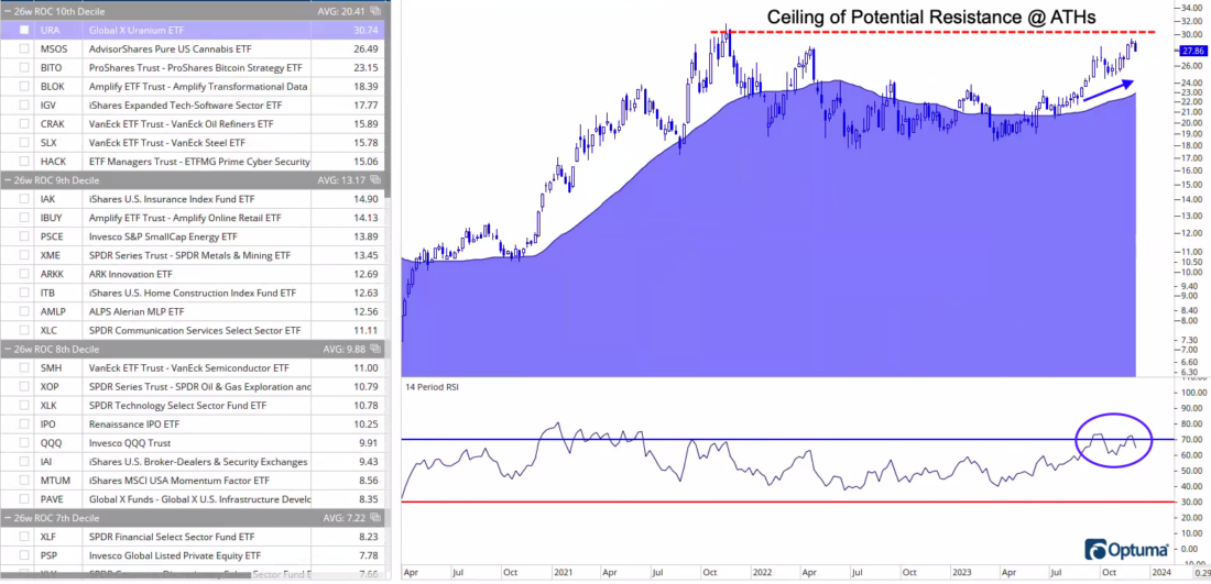
We already know (from the charts I shared earlier this week on Investopedia’s Chart Advisor) that the U.S. is still the place to be in terms of asset class exposure. For this reason, as well as the studies mentioned above, this first chart uses an inventory of U.S. sectors and industry groups and ranks them using a 26-week rate of change.
Six months (or 26 weeks) is a nice, sweet spot for RS when coming up with buying candidates, so if you’re looking for some good, domestic “baskets” of stocks (i.e., ETFs), this is a great way to do it.
The next step would be to go thru each of the charts in the top quartile (or so), analyzing each chart individually, and determining whether it would be a good potential buy for you. The top-ranked ETF in the screen just happens to be the Global X Uranium ETF (URA), and you can see how it has a rising 50-day moving average, and recently (in the lower-pane) RSI(14) crossed above 70, which indicates the position has entered a bullish momentum regime.
Once you get to this juncture, you’d want to put an exit strategy in place… whether it be a moving average, a floor of potential support, or you could also use a ranking system. For example, if a position you own falls into the 6th decile of the inventory (which suggests is strength is weakening – and it might not make the metaphorical “playoffs” this year), then you would eject that position and replace it with something at the top of the inventory that you don’t already own.
2/ Adobe on the Move
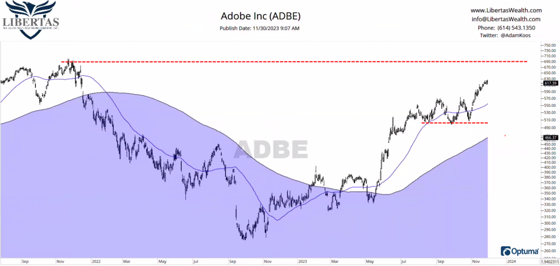
RS screens, such as the 26wROC we used in the first chart, aren’t JUST for ETFs. We can use these types of screens on individual stocks as well.
When I ran the same screen on the S&P 500, Adobe (ADBE) came up as the #3 ranked stock on an RS-basis, amongst all of the stocks within the index.
When you drill down and analyze the chart, you can see a rising 200 MA, a rising 50 MA, a couple good places to place a potential stop-loss (including potential support at the three lows you can see at the red-dashed line between July & October), and Adobe just happens to be closing in on its all-time-highs.
Oh, and for those of you who are reading this, thinking to yourself “I don’t want to buy a stock near all-time-highs, do I?!”
All-time-highs are not bearish.
Humans are terrible investors, by nature. Our emotions get in the way with every decision we make. So, when I hear “I want to wait for a pull-back before I invest my money,” what I hear is, you want to wait for prices to get lower. Okay… fine.
…but when the market goes through a correction, like it did between July and October of this year, and I hear follow-up comments, such as “Well, I want to wait for things to get better before I invest,” what I hear is that you want to wait for prices to get higher. What?!
When searching for good investment candidates for your portfolio, don’t allow your emotions to fixate on getting a “deal.” Instead, understand that success in investing is less about “buying low” and a whole lot more about “buying high and selling higher!”
Full disclosure, we own ADBE in four of our client portfolio models at Libertas Wealth.
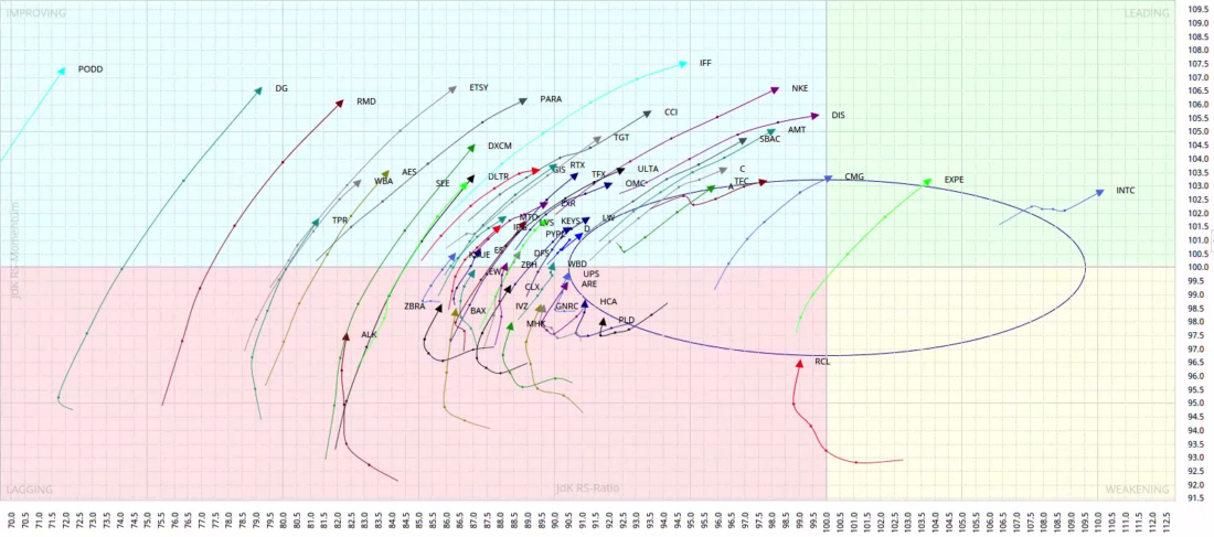
3/ Relative Rotation Graph
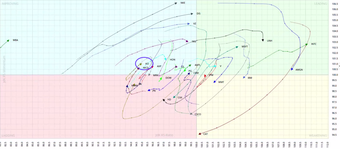
Another great screening tool when looking for potential buying candidates is a Relative Rotation Graph (RRG). Invented by my friend Julius de Kempenaer in the early 2010’s, RRGs are, without question, the best way to visualize relative strength.
The way to read these charts is simple…
The center point of the RRG (at the zero point on the x/y axis) is the benchmark. In this RRG, I inputted the Dow Jones Industrial Average as the index to which the RRG is comparing its components. Then, plotted around the RRG are all 30 stocks within the DJIA index.
When observing the arrows in the RRG, each points at the “direction” the investment is headed. Furthermore, each dot in its “tail” is one week, because I chose to create a weekly RRG (you can also create daily, or even monthly relative rotation graphs, but my intermediate timeframe justifies a weekly observation). The further apart each dot is, the higher the velocity of change across each quadrant.
Speaking of quadrants, here is a description of what each means:
- NW Quadrant: Improving vs. the benchmark
- NE Quadrant: Leading the benchmark
- SE Quadrant: Weakening vs. the benchmark
- SW Quadrant: Lagging the benchmark
Now that we understand the basics of an RRG, let’s pick a stock. I see a small handful of potential buying candidates here, but let’s just pick McDonald’s (MCD) as a position we’d like to analyze further, because it’s pointing Northeast, leaving the lagging quadrant, and entering into the improving quadrant (continued below…).
4/ McDonald’s Potential
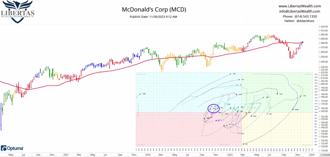
Here is a weekly RRG Candlestick Chart of McDonalds (MCD) with the same RRG we observed above as an overlay for simplicity.
MCD has been in a long-term uptrend for some time now, and it happened to fall along with the rest of the market from July thru October. However, as its traveled into the improving quadrant, you can see how the stock is also coming off its lows, crossing above major trendlines and closing in on its all-time-highs (again, not bearish!).
So with that all being said, MCD would be a good potential buying candidate for an investor looking to get exposure to a large-cap stock in a long-term uptrend, that also just happens to be exhibiting some near-term relative strength.
As always, once you decide on your entry point, you’d want to have an exit strategy in place. Again, you could use a moving average, a floor of potential support, or if you want to be really conservative, you can use your entry point as your stop (as long as you can remain nimble, and you’re not afraid to trade-up and jump back into the stock if you get whipsawed).
5/ Broadening Your Inventory
Last, but certainly not least, you don’t have to use such a limited inventory when screening for buying candidates with an RRG. As mentioned above, there are only 30 stocks on the Dow Jones Industrial Average, so the Dow might be a little small, and you might not get a high enough quantity of opportunities.
Instead, you could input all of the stocks on the S&P 500 and then use the S&P 500 as the benchmark. The problem is, if you try to analyze all 503 stocks on the SPX, the RRG is going to look like you tried to cook two packets of Ramen Noodles into a small bowl.
How do you fix this problem? I’ll tell you…
Julius de Kempenaer and Mathew Verdouw (the founder and CEO of Optuma) implemented what I would consider to be ground-breaking research using RRGs, and what they found was that buying stocks in the leading quadrant was usually “too late.” Instead, the found that the best buying candidates appeared in the lagging quadrant (SW) with their arrows pointing Northeast. Stocks in the improving quadrant (NW) pointing Northeast were also good prospective stocks, but the best opportunities came out of the lagging quadrant.
Knowing this, I reached out to Optuma’s software developer, Darren Hawkins, to get some help with creating an RRG that uses the S&P 500 as the benchmark. We then programmed the software to only show me the stocks that are pointing Northeast, so as to filter out all the positions I had no interest in. I added one more filter – the circle in the middle – which is two standard deviations from center, because the further outside the zero point on the x/y axis (i.e., the benchmark), the higher the momentum.
You can go down a serious rabbit hole when you start tinkering with RRGs. For instance, instead of the S&P 500, you could use the Russell 2000 as the benchmark and then input all 2000 stocks in the R2K into your RRG. It starts to get a little overwhelming, but with the powerful software, implementing the right kind of screen, all while using rules that make sense, the metaphorical sky is truly the limit.
Now that we’ve drilled down this far, you can focus on the stocks in and/or leaving the lagging quadrant, analyze the individual charts, and find a couple potential candidates to buy!
However, we’re out of room and I’m out of time (at least THIS time) on Investopedia’s Chart Advisor. So, if you made it this far, I hope that you learned a least a LITTLE something new this week.
Merry Christmas, Happy Hannukah, and I wish you the best in your portfolio this holiday season!
—
Originally posted 1st December 2023
Disclosure: Investopedia
Investopedia.com: The comments, opinions and analyses expressed herein are for informational purposes only and should not be considered individual investment advice or recommendations to invest in any security or to adopt any investment strategy. While we believe the information provided herein is reliable, we do not warrant its accuracy or completeness. The views and strategies described on our content may not be suitable for all investors. Because market and economic conditions are subject to rapid change, all comments, opinions and analyses contained within our content are rendered as of the date of the posting and may change without notice. The material is not intended as a complete analysis of every material fact regarding any country, region, market, industry, investment or strategy. This information is intended for US residents only.
Disclosure: Interactive Brokers
Information posted on IBKR Campus that is provided by third-parties does NOT constitute a recommendation that you should contract for the services of that third party. Third-party participants who contribute to IBKR Campus are independent of Interactive Brokers and Interactive Brokers does not make any representations or warranties concerning the services offered, their past or future performance, or the accuracy of the information provided by the third party. Past performance is no guarantee of future results.
This material is from Investopedia and is being posted with its permission. The views expressed in this material are solely those of the author and/or Investopedia and Interactive Brokers is not endorsing or recommending any investment or trading discussed in the material. This material is not and should not be construed as an offer to buy or sell any security. It should not be construed as research or investment advice or a recommendation to buy, sell or hold any security or commodity. This material does not and is not intended to take into account the particular financial conditions, investment objectives or requirements of individual customers. Before acting on this material, you should consider whether it is suitable for your particular circumstances and, as necessary, seek professional advice.
Disclosure: ETFs
Any discussion or mention of an ETF is not to be construed as recommendation, promotion or solicitation. All investors should review and consider associated investment risks, charges and expenses of the investment company or fund prior to investing. Before acting on this material, you should consider whether it is suitable for your particular circumstances and, as necessary, seek professional advice.


Join The Conversation
If you have a general question, it may already be covered in our FAQs. If you have an account-specific question or concern, please reach out to Client Services.