


1/ Asset Allocation
2/ Financial Conditions and IWM
3/ Commodities, FX and Rates
4/ Global Equity Flows
Investopedia is partnering with CMT Association on this newsletter. The contents of this newsletter are for informational and educational purposes only, however, and do not constitute investing advice. The guest authors, which may sell research to investors, and may trade or hold positions in securities mentioned herein do not represent the views of CMT Association or Investopedia. Please consult a financial advisor for investment recommendations and services.
1/ Asset Allocation

The investment process I have developed in my 30+ years in the market has three parts to it: fundamental, technical, and catalyst. Much like technical analysis, my process is fractal that means it can work at any scale. For technical analysis that means we can use the same indicators for hourly, daily, weekly or yearly. For my process, that means I can use this approach at a single security or at a portfolio level. Essentially, if a security has fundamentals, technicals, and catalysts in its favor, it is a full-sized position. If only one is in its favor it is ⅓ of a position. If two categories cancel out, there is no position and I only watch. Much like all of technical analysis, this approach keeps a discipline that allows me to assess what at times seems to be competing flows of information.
The last two days, using the intermarket analysis, I covered areas that I would put into the fundamental category – growth, inflation, FOMC policy and portfolio construction. The next two days I will dig into the more technical portion of the process using more traditional technical charts.
The first chart today is the Relative Rotation Graph (RRG) that I first learned about when I was studying for my CMT charter. I find this graph to be immensely powerful in that it can encapsulate flows and sentiment across a number of products in one graph. A trader or investor can set it up however they want, using the products and benchmark that they wish.
I have used a Bloomberg NW screen that holds ETFs and Indexes across a range of products. As the benchmark, I use SOFR futures, which is a 3-month cash rate with the idea that anyone can prefer cash to these products.
There are four quadrants on this chart starting in the upper right and moving clockwise: leading, weakening, lagging and improving. Assets in the upper right are leading all other assets and attracting the most attention and flows. Those in the weakening category are former leaders that are starting to wane in importance. This is a critical sign of potential weakness. The next category is lagging and these are the assets that investors are leaving behind and not paying attention to. You don’t want to be here. However, every laggard eventually starts to improve and moves to the upper right. Therefore, I always find the lower left and the upper right to be the most actionable places.
A quick glance shows us that the crypto products like Bitcoin and Ether are the clear leaders over the past 12 weeks while oil, commodities, and China are the clear laggards. There is nothing really in the weakening category as the commodities have gone through here and into lagging. DBA – the agriculture ETF – is the only thing in the weakening category.
Most interesting to me are the number of products that are in the improving category. This includes; small-caps, dividend stocks, emerging markets, bonds, buywrite ETFs, and most favorite short indexes. For a market that has been criticized for not having enough breadth, there are a large number of laggards that are showing improving momentum right now.
2/ Financial Conditions and IWM

Speaking of small-cap stocks, these had largely missed the entirety of the 2023 stock market rally until the last month of the year, when over 90% of the annual returns occurred. What drove this? We can perhaps see this in the second chart today.
On this chart I plot the Bloomberg US financial conditions and compare it to the relative performance of small-cap stocks (IWM) and large-cap stocks (SPY). There is intuitive logic in what the chart shows us. It says that as financial conditions improve, small-caps tend to outperform and do the best. However, when conditions get more difficult, investors seek the safety of larger cap stocks.
We can see this as the very easy conditions in 2020 led to large IWM outperformance. However, as investors began to fear the removal of this stimulus, and then the active Fed policy at tightening conditions, the IWM went on an extended period of meaningful underperformance, that began in mid-2021 and lasted until December of 2023. Over the last month, the IWM has been one of the top performing assets and is in our improving category. What has changed? Financial conditions have begun to get easier again.
3/ Commodities, FX and Rates
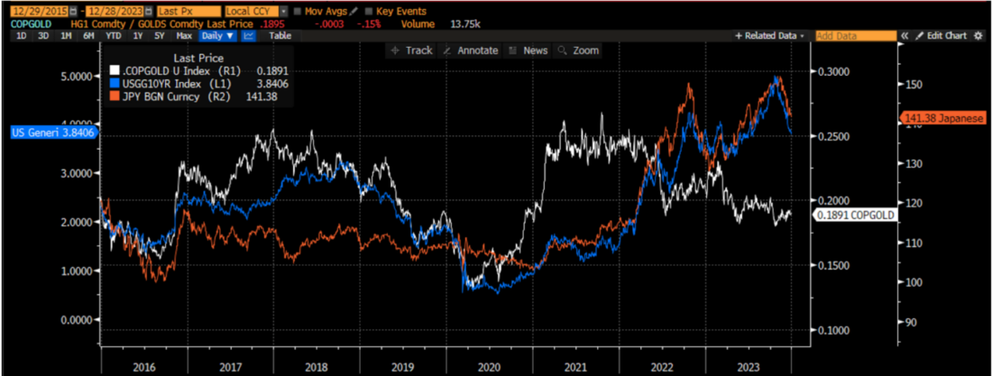
The third chart is a core chart for me. I make sure that I always make sure I know where these assets are. The blue line is the 10-year US Treasury yield. It is the benchmark rate upon which we price all other assets – mortgages and corporate bonds as a spread, foreign government bonds as a spread, commodity futures, and equity multiples. I tell my students that if they can only remember one market measure, they should know 10-year yields. As we saw in the RRG, bonds had a very good Q4 and we can see that 10-year yields have fallen from 5% to under 4%. What is driving this?
The first reaction may be FOMC policy and this is certainly a component of it. However, there are some other drivers that I want to highlight. The first is the white line which is the ratio of copper prices to gold prices. This is a ratio that bond kings such as Bill Gross and Jeffrey Gundlach have both said is a ratio they strongly consider. This ratio measures the commodity market perception of global growth. Copper is a commodity that is used in plumbing and electricity, whether that is in residential housing or the electrification of the grid. It is used globally. When commodity investors are positive on growth, you can see copper outperform gold. When they are negative on growth, copper suffers on a relative basis. We use gold because it takes out any FX effects. It is a pure measure of global growth expectations. We can see this has been falling for much of 2022 and 2023 in spite of the stronger US economy.
The orange line is another important line. It is the USD/JPY FX rate. Japanese investors have the largest pool of savings in the world. These investors seek better returns outside of their home market when they feel the time is right. For much of 2023, Japanese investors, who are the largest owner of Treasuries, were less interested based on the FX rate. However, all of this changed in Q4 of 2023.
Both of these factors are leading to lower 10-year US Treasury rates, which underpin the pricing of all other assets. Can it continue in 2024?
4/ Global Equity Flows

I started my career in the FX market and one thing I learned very early on is that FX rates are impacted by investors’ perception of returns. FX doesn’t drive money flows, it is a symptom of money flows. As the saying goes, money flows to where it is treated the best.
As investors feel the relative growth rates are the highest in the US relative to the rest of the world, investors tend to prefer US assets, namely US equities, relative to other assets. Thus, we see a strong dollar index at this time. When investors feel global markets have a higher return potential, money flows outside the US and the dollar weakens.
We see this from 2004-2010 as investors thought returns would be higher outside the US, there was an outperformance of EFA which is the MSCI EAFE ETF. From 2011 through 2023, however, investors have preferred US markets as we see SPY outperforming EFA quite materially over this period. As a result, the dollar strengthens over the entire period. As we ended 2023, we started to see small signs of the relative performance of SPY starting to wane vis a vis EFA and have seen the corresponding weakening of the dollar index. Is this a trend that will continue in 2024?
—
Originally posted 4th January 2024
Disclosure: Investopedia
Investopedia.com: The comments, opinions and analyses expressed herein are for informational purposes only and should not be considered individual investment advice or recommendations to invest in any security or to adopt any investment strategy. While we believe the information provided herein is reliable, we do not warrant its accuracy or completeness. The views and strategies described on our content may not be suitable for all investors. Because market and economic conditions are subject to rapid change, all comments, opinions and analyses contained within our content are rendered as of the date of the posting and may change without notice. The material is not intended as a complete analysis of every material fact regarding any country, region, market, industry, investment or strategy. This information is intended for US residents only.
Disclosure: Interactive Brokers
Information posted on IBKR Campus that is provided by third-parties does NOT constitute a recommendation that you should contract for the services of that third party. Third-party participants who contribute to IBKR Campus are independent of Interactive Brokers and Interactive Brokers does not make any representations or warranties concerning the services offered, their past or future performance, or the accuracy of the information provided by the third party. Past performance is no guarantee of future results.
This material is from Investopedia and is being posted with its permission. The views expressed in this material are solely those of the author and/or Investopedia and Interactive Brokers is not endorsing or recommending any investment or trading discussed in the material. This material is not and should not be construed as an offer to buy or sell any security. It should not be construed as research or investment advice or a recommendation to buy, sell or hold any security or commodity. This material does not and is not intended to take into account the particular financial conditions, investment objectives or requirements of individual customers. Before acting on this material, you should consider whether it is suitable for your particular circumstances and, as necessary, seek professional advice.
Disclosure: ETFs
Any discussion or mention of an ETF is not to be construed as recommendation, promotion or solicitation. All investors should review and consider associated investment risks, charges and expenses of the investment company or fund prior to investing. Before acting on this material, you should consider whether it is suitable for your particular circumstances and, as necessary, seek professional advice.
Disclosure: Digital Assets
Trading in digital assets, including cryptocurrencies, is especially risky and is only for individuals with a high risk tolerance and the financial ability to sustain losses. Eligibility to trade in digital asset products may vary based on jurisdiction.


Join The Conversation
If you have a general question, it may already be covered in our FAQs. If you have an account-specific question or concern, please reach out to Client Services.