Python is known to be the most popular programming language today ⁽¹⁾. Further, Python Matplotlib is a way of visualising the data. It is quite essential to have accessible ways to view and understand the data’s impact with the help of graphs or plots.
Let us now learn more about visualising data with Python Matplotlib with this blog that covers:
- What is Python Matplotlib?
- Why do we need data visualisation?
- Basic terms and concepts in Matplotlib
- Plotting data in Python Matplotlib
- Plot customization using Python Matplotlib
- Multiple plots using Python Matplotlib
What is Python Matplotlib?
Matplotlib is a popular Python library that can be used to create data visualisations quite easily. It is probably the single most used Python package for 2D graphics along with limited support for 3D graphics.
It provides both a rapid way to visualise data from Python and publication-quality figures in many formats. Also, It was designed from the beginning to serve two purposes:
- Allow for interactive, cross-platform control of figures and plots
- Make it easy to produce static vector graphics files without the need for any GUIs.
Much like Python itself, Matplotlib gives developers complete control over the appearance of their plots. It tries to make easy things easy and hard things possible. We can generate plots, histograms, power spectra, bar charts, error charts, scatter plots, etc., with just a few lines of code.
For simple plotting, the pyplot module within the matplotlib package provides a MATLAB-like interface to the underlying object-oriented plotting library. It implicitly and automatically creates figures and axes to achieve the desired plot.
For importing Python matplotlib you simply need to first install matplotlib and then import the same by using these commands-
pip install matplotlib
Install_matplotlib.py hosted with ❤ by GitHub
import matplotlib
Import_matplotlib.py hosted with ❤ by GitHub
Why do we need data visualisation?
The importance of data visualisation is simple: it helps people see, interact with, and better understand data. Whether simple or complex, the right visualisation can bring everyone on the same page, regardless of their level of expertise.
It’s hard to think of a professional industry that doesn’t benefit from making data more understandable ⁽²⁾. Every STEM field benefits from understanding data—and so do fields in government, finance, marketing, history, consumer goods, service industries, education, sports, and so on.
While we’ll always wax poetically about data visualisation (you’re on the Tableau website, after all), there are practical, real-life applications that are undeniable. And, since visualisation is so prolific, it’s also one of the most useful professional skills to develop. The better you can convey your points visually, whether in a dashboard or a slide deck, the better you can leverage that information.
As the skill sets are changing to accommodate a data-driven world, it is increasingly valuable for professionals to be able to use data to make decisions. Moreover, the visuals help to tell the detailed stories of the who, what, when, where, and how.
While traditional education typically draws a distinct line between creative storytelling and technical analysis, the modern professional world also values those who can cross between the two: data visualisation sits right in the middle of analysis and visual storytelling.
Basic terms and concepts in Matplotlib
Python Matplotlib allows creating a wide variety of plots and graphs. Matplotlib is a large project and can seem daunting at first. However, we will start learning the components, and it should feel much smaller and approachable.
Different sources use ‘plot’ to mean different things. So let us begin by defining specific terminology used across the domain.
- Figure is the top-level container in the hierarchy. It is the overall window where everything is drawn. We can have multiple independent figures, and each figure can have multiple Axes. It can be created using the figure method of pyplot module.
- Axes is where the plotting occurs. The axes are effectively the area that we plot data on. Each Axes has an X-Axis and a Y-Axis.
The example mentioned below illustrates the use of the above-mentioned terms:
fig = plt.figure()
Fig.py hosted with ❤ by GitHub
Upon running the above example, nothing happens really. It only creates a figure of size 432 x 288 with 0 Axes. Also, Python Matplotlib will not show anything until told to do so. Python will wait for a call-to-show method to display the plot.
This is because we might want to add some extra features to the plot before displaying it, such as title and label customisation. Hence, we need to call plt.show() method to show the figure as shown below:
plt.show()
Show.py hosted with ❤ by GitHub
As there is nothing to plot, there will be no output. While we are on the topic, we can control the size of the figure through the figsize argument, which expects a tuple of (width, height) in inches.
fig = plt.figure(figsize=(8, 4))
plt.show()
Fig_size.py hosted with ❤ by GitHub
Axes
All plotting is done concerning an Axes. An Axes is made up of Axis objects and many other things. An Axes object must belong to a Figure. Most commands that we will ever issue in Python Matplotlib will be concerning this Axes object.
Typically, we will set up a Figure, and then add Axes on to it. We can use fig.add_axes but in most cases, we find that adding a subplot fits our need perfectly. A subplot is an axes on a grid system.
add_subplot method adds an Axes to the figure as part of a subplot arrangement.
# Creating figure
fig = plt.figure()
# Creating subplot
ax = fig.add_subplot(111) # Subplot with 1 row and 1 column at the index 1
plt.show()
Subplot.py hosted with ❤ by GitHub
Figure 1

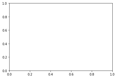
The above code adds a single plot to the figure fig with the help of theadd_subplot method.The output we get is a blank plot with axes ranging from 0 to 1, as shown above.
In Python Matplotlib, we can customise the plot using a few more built-in methods. Let us add the title, X-axis label, and Y-axis label, and set the limit range on both axes. This is illustrated in the below code snippet.
fig = plt.figure()
# Creating subplot/axes
ax = fig.add_subplot(111)

# Setting axes/plot title
ax.set_title('An Axes Title')

# Setting X-axis and Y-axis limits
ax.set_xlim([0.5, 4.5])
ax.set_ylim([-3, 7])

# Setting X-axis and Y-axis labels
ax.set_ylabel('Y-Axis Label')
ax.set_xlabel('X-Axis Label')

# Showing the plot
plt.show()
Customise_subplot.py hosted with ❤ by GitHub
Figure 2

Python Matplotlib’s objects typically have lots of explicit setters, i.e. methods that start with set_something and control a particular option. Setting each option using explicit setters becomes repetitive, and hence we can set all required parameters directly on the axes using the set method as illustrated below:
fig = plt.figure()

# Creating subplot/axes
ax = fig.add_subplot(111)

# Setting title and axes properties
ax.set(title='An Axes Title', xlim=[0.5, 4.5], ylim=[-3, 7], ylabel='Y-Axis Label', xlabel='X-Axis Label')
plt.show()
Set_parameters.py hosted with ❤ by GitHub
The set method does not apply to Axes; it applies to more-or-less all Python Matplotlib objects.
The above code snippet has the same output as figure 2 above using the set method with all required parameters passed as arguments to it.
Stay tuned for the next installment to learn about Axes method v/s Pyplot.
Originally posted on QuantInsti blog.
Disclosure: Interactive Brokers
Information posted on IBKR Campus that is provided by third-parties does NOT constitute a recommendation that you should contract for the services of that third party. Third-party participants who contribute to IBKR Campus are independent of Interactive Brokers and Interactive Brokers does not make any representations or warranties concerning the services offered, their past or future performance, or the accuracy of the information provided by the third party. Past performance is no guarantee of future results.
This material is from QuantInsti and is being posted with its permission. The views expressed in this material are solely those of the author and/or QuantInsti and Interactive Brokers is not endorsing or recommending any investment or trading discussed in the material. This material is not and should not be construed as an offer to buy or sell any security. It should not be construed as research or investment advice or a recommendation to buy, sell or hold any security or commodity. This material does not and is not intended to take into account the particular financial conditions, investment objectives or requirements of individual customers. Before acting on this material, you should consider whether it is suitable for your particular circumstances and, as necessary, seek professional advice.


Join The Conversation
If you have a general question, it may already be covered in our FAQs. If you have an account-specific question or concern, please reach out to Client Services.